Sunday, November 30, 2008

1996 Select Certified

Cards with a mirror finish! The scan doesn't do this card justice. The background behind Cal is as bright as a mirror. The card logo and player name are in gold foil. The cards came with a plastic film to protect the surface.

I purchased the entire 144 card set in 2004 on eBay for $12 (including S&H). The cards were originally sold in 6-card packs for $4.99. That's 83 cents a card in 1996. I got them for a tenth that.

The cards were produced by Pinnacle, which had obtained the Score brand by then. Select had been a Score product starting in 1993. Card companies like to put words like "Certified" in their card names to signify something special. Certified has two meanings: "officially recognize (someone or something) as possessing certain qualifications or meeting certain standards" and "officially declare insane". I'm guessing that Pinnacle had the first meaning in mind but the second meaning may more accurately describe the state of the baseball card business in the mid to late 1990s.

By the time I bought these cards the plastic film had been on there for 8 years. Due to the difference in materials (the card vs. the film) the cards were all bowed inward. This happens because the cardboard absorbs moisture while the plastic film does not. So the card expands a bit but the plastic film cannot expand. So the card bows. The film was real hard to get off as well but the cards appear to have not been damaged.

Thursday, November 27, 2008

Take Me Out To The Ball Game

This card is a single card insert in 2008 Topps Updates & Highlights set. I got it in an 18-card pack I picked up on a whim.

As you can see the song was originally published in 1908, so this is the 100th anniversary of the song.

There is a long piece on Wikipedia about the song. What I thought was interesting is that the guy who wrote the words had never been to a baseball game before he wrote the song. In fact, he didn't go to his first game until 32 years after he wrote the song! The composer hadn't been to a game either.

The song was a big hit in 1908, with several recordings having been made.

The big surprise to me is that the song has verses. The familiar refrain, is just that, a refrain, or chorus. I don't believe that I've
ever heard the verses.

There are almost 150 versions available on iTunes. I sampled a bunch of them and none seem to have the verses. Most of the versions are pretty short, about 2 minutes long, not enough time for verses.

After rooting around on the Internet for awhile, I realized that I had heard the verses, on Ken Burn's Baseball sung by Carly Simon.

Here is a site I found that has Simon's version (pretty much the original 1908 lyrics) and another version based on the 1927 lyrics.

Enjoy.

Tuesday, November 25, 2008

To write or not to write

Someone thought a card of Willie Davis was worth selling didn't they?

This is a Topps Super card, which came from a set of 3-by-5 cards issued by Topps in three-card packs in 1970. The backs look identical to the backs of the regular-issue 1970 cards, but these cards are much thicker. They're more like slabs than cards.

But the reason this card is featured here is because of the hand-written price tag on it. I'm not sure how this card was obtained originally. I received it from Stats on the Back. Mark might have the answer. Perhaps it was picked up at a rummage sale in which the seller thought nothing of scrawling the price right on the card.

We've all seen examples of writing on baseball cards. Names scribbled out. New names scribbled in. Commentary added. Mustaches and glasses drawn on faces. We've all been amused by it. But part of our amusement comes from the knowledge that "we know better than that now."

Today, the only writing that you see on a card is an autograph. Cards are considered too valuable to have a pen touch the card in any other manner. No commentary, no scribblings, no mustaches. It got me thinking that, unless it is an autograph, I haven't seen writing on any card from the last 15-20 years.

I thought about it so much that I got curious. Just what would a modern-day card look like with a little scribbling?

So I did this:
So THAT'S what it would look like. Man, did that feel good. And don't worry, I have six of these Orlando Hudson A&G cards.

This one in particular will cost you 20 cents.

Monday, November 24, 2008

1986 G.I. Joe Trading Cards

Were you aware that Milton Bradley put out a G.I. Joe trading card set in 1986? I sure wasn't! If I would have seen these in 1986, I probably would have picked them up. I never saw them, so my money went towards Baseball Tattoos, All-Star pop-ups and G.I. Joe comic books.

I was a huge G.I. Joe fan in the mid eighties. I thought most of the storylines in the cartoon were imaginative and well thought out. It never seemed like they were trying to just sell a product. It seemed like the staff of the cartoon and the comic book really cared about the characters and enjoyed what they did.

This was a set of 192 cards and 12 stickers. I would have been up to the challenge of wasting my money on trying to complete the set, in 1986. Now... not so much. I still get a nostalgic twinge when I run across anything G.I. Joe related. I'll pop in the cartoon DVD sets that I own on a whim. Maybe once every three years, I'll dig out the old comic books and give them a read.

I can't help it. G.I. Joe was a huge part of my life back then. It's only natural to go back to the well when you need to feel like a kid again. If the stories would have sucked, I don't think I would ever want to relive those plotlines. I appreciated the fact that the writers never dumbed anything down for the kids. Not intentionally anyway.

To see pictures of the packaging and a more in depth look at the set, check this out.

The cards featured art from the action figures, the vehicles and stills from the cartoon. This would have been right up my alley in 1986. There were 8 cards and 1 sticker per pack. 96 packs came to each case.

Cards 1-30 featured the Joe team. Cards 31-65 featured Joe accessories. 66-95 featured action shots. Cards 97-113 featured Cobra members. 114-126 were Cobra accessories. 127-191 were more action shots. Cards 96 and 192 were the obligatory checklists.

The card checklist looks like there was some thought given to alignment. It seems pretty much in order. It would be interesting to see how all of these cards would look in an album. The art that I've seen uses the 1985 blister pack artwork from the action figures. I preferred the 1985 packaging with the more cartoony explosion, rather than the 1986 digital Morse code burnout that took over the background.

It appears that the corners are rounded on the cards. I really like that on some card releases. It seems to fit well with the subject matter and the artwork. Actually, I think I'm glad that I never saw these in 1986. Those cards would have been destroyed from overuse!

Sunday, November 23, 2008

Chew on this

When you decide to invite a puppy into your home, there are a few things that become apparent immediately.

First, a puppy is like a newborn baby in many ways. You have to teach him how to sleep, how to speak, how to go to the bathroom. Fun!

Secondly, you now have competition for your food. Remember those old days of putting food on the table, then going back to the kitchen to get a drink or something you forgot? Gone. The dog will catch on to any careless action when it comes to food.

Finally, and this is most important: YOU MUST KEEP EVERYTHING YOU VALUE IN LIFE UP HIGH.

After countless early lessons, I thought I had gotten that third point down cold five months into owning Dodger (yes, he's named after my favorite baseball team). But I got careless last week. According to Dodger, baseball cards ARE food, and he somehow snagged a pack each of Upper Deck Masterpieces and Baseball Heroes and made them into his personal doggie 1 of 1s.

Let's take a look at a dog's artistry. To him, at least, these are works of art. To others, they are a travesty. I know a few card bloggers out there who might want to look at the rest of this post with their hands over their eyes.

First we have the Masterpieces cards and Hanley Ramirez. This card, compared with the others, came away relatively untouched. But it's a shame this is a two-dimensional image, because there are teeth marks all up and down the top and bottom of the card. If you stack these nine dog-chewed cards next to a pile of nine cards untouched by canine saliva, the chewed cards are more than twice as high as the others.

Avert your eyes David of Tribe Cards! Dodger went right for Hafner's spikes on this card. Dogs love their shoes. He punched a hole just to the right of the "R" in "Hafner."

Dodger's quite the fan of one of Patricia's favorite pitchers, Barry Zito. You can even see at the bottom right where my dog signed the card -- with his teeth. I had trouble lining these cards up on the scanner, because they had suddenly taken on the look and feel of a relief map.

I'm showing the Carew card again because it's the only one, believe it or not, that has a piece missing. I don't know where that missing piece is -- probably long digested by now.

On to the Heroes cards. It looks like Dodger chewed and slobbered on this one for quite awhile. Serves Figgins right for being an Angel.

I said in a comment on another blog that this was a black parallel card of Hughes. I don't know why I said that. It's obviously not. I made the comment the day of "the incident," so I must've still been in shock. The Hughes card is torn in two places up at the top.

Frenchy doesn't look too worse for wear. But there's actually creases all over the card. And none of these cards will lie flat.

A couple of big rips through Brandon Webb's card. By the way, I am SO glad there were no Dodgers in any of these packs. And that's the first time I've ever said that sentence.

Finally, Steve, I'm sorry. A tattered black parallel of Paul Konerko. But at least Dodger appeared to like the card -- a lot!

I suppose the good news is none of these cards were short-prints, at least not that I know of, and none, aside from the Konerko, were parallels.

All of my cards are in safe keeping away from Dodger. But as you can see, I have to be vigilant at all times. Because while you may see cardboard, my dog sees FOOD!

Thursday, November 20, 2008

2005 Uno

As is often the case, a post by someone else reminded me of something I had which would make a good post.

Here is a card from the 2005 Uno Baseball American League Set. There was another set featuring National League players.

The set came in a metal box and is a complete Uno game. I was disappointed to find that each color suit featured the same players, in other words, the 7 card has Ivan Rodriguez in each color. Here are the players featured:

0 - Johan Santana
1 - Mark Teixeira
2 - Houston Street
3 - Carl Crawford
4 - Miguel Tejada
5 - Runelvys Hernandez
6 - Travis Hafner
7 - Ivan Rodr1guez
8 - Ichiro
9 - Roy Halladay
Reverse - David Ortiz
Skip - Derek Jeter
Draw 2 - Vladimir Guerrero
Draw 4 - Mark Buehrle
Top 2 - Ozzie Guillen and Phil Garner

My guess is that the photo on the Top 2 card is from the 2005 World Series. The two men are embracing. Garner congratulating Guillen for the Series win?

Its a pretty nice item. I didn't realize when I bought it that there were separate National and American League sets. When I was back in the Toys R Us where I found this they were out of the National League set.

Wednesday, November 19, 2008

1984 Gremlins

In the summer of 1984, there were three big movies that my classmates had to see over the summer to have a shot at any social life. Indiana Jones & The Temple Of Doom, Ghostbusters and Gremlins. I got to see Temple Of Doom at Ford City Theaters with my dad. This was before the gang problems that plagued the site in the nineties.

Ghostbusters, I saw with my parents at the drive-in. Gremlins, I saw with my dad at the drive-in, in an orange Gremlin of all things. I was captivated by all three movies that summer. I'm sure if I think about it, I could name other movies I saw that summer, but those are the three that stick out.

I don't remember Ghostbusters cards. I vaguely recall Temple Of Doom cards. Gremlins cards were a different story. I probably picked up more packs of that in 1984 than actual sports cards. Where are they all now? They are lost to time. I can fondly remember the bright yellow colors and the comic book frenzied lines framing a movie still or publicity shot.

The set consisted of 82 cards. I was always a few cards short of completing the set. I would literally spend hours sifting through my Gremlins cards in 1984. A few years later they would be misplaced and never seen again. I still have my childhood memories from this set and that's good enough for now.

I could relive the movie without spending $3.00 on a ticket or having to wait until it popped up on cable a year or two later. That may have been why I lost interest in this set. When it finally came on cable, I no longer needed the set to watch the movie. Nor did I need my View Master discs to relive the action. These cards served their purpose and now they are a nice memory.

1990 U.S. Playing Cards

It was bound to happen sooner or later. Major League players on actual playing cards. These were really popular in the early nineties. Then, after a few years, they seemed to disappear altogether.

I'd certainly be interested in seeing current Major League players on playing cards. For that matter, I'd also be interested in old school players in the same format. I suppose this is one of those ideas that was keen in the nineties, but ultimately has no place in today's society.

I can chalk it up as an oddity of the time, but I have a feeling that somewhere, somehow these cards will be resurrected in the near future. There doesn't seem to be as many oddball releases currently. Everything seems to be based on an insert today. No originality. Even the cards that Topps bestowed on Pepsi in 2007 looked just like the flagship release.

As you can see in the example, Griffey Jr. was popular enough to warrant the jack of spades. A face card for a rookie seems unbelievable. Yet, there he is. This release had all the names of the day. It even had Greg Olson and Gregg Olson! Then you get into Jeff Brantley, Neal Heaton and Brook Jacoby. They don't exactly spark any memories for me, but I'm sure they do if they played on your team.

What early nineties set would be complete without Bob Welch? Well, it wouldn't be complete without the 27 game winner. A feat he never came remotely close to again. In fact, he never got past 17 wins before that. After that magical season, he only managed to hit 12 wins... once.

I keep getting beat up playing cards in trades. I think they are a unique product of the early nineties. I know that it's not an original idea, but it seemed to culminate around this period. There always seemed to be a steady stream of MLB playing cards around 1991. As time moves on, this may be the only card that really retains some value from 1990. Everything else was too mass produced to be worth anything but sentimental value. These cards were meant to be played. Maybe that will be the saving grace in the future.

Saturday, November 8, 2008

DIY 3-D Cards - Kickin it old school

For no other reason than "I felt like it," I decided to put together some old school 3-d cards and post a mini 'how-to' on here. After all, what better place to talk about making your own 3-d cards than on TDTC!?

I will be discussing two variations on the theme - a two-card method and a three-card method. You, of course, could use more cards if really want to get into it. Just know that the more cards you want to incorporate, the more planning you need to do. Materials needed include: duplicates of the same card of the same year etc; scissors or a hobby knife (X-Acto); glue, tape, or other adhesive.

Our first subject is Jim Abbott. I chose him for two reasons: 1) I have about 8 of these same card, and 2) It would be an easy 2-carder.

So, let's look at the 1996 Pinnacle Jim Abbott:

We see a pitcher in motion with the crowd behind him. We also see the triangle shape at the bottom, and because of some nice camera work, some of the 'brighter' areas of the player. His leg, right arm, cap, and ear are all "in front" of the other parts of his body. Once you decide what parts you want to 'bring forward,' you can cut those out of the second card. Do NOT cut anything on the first (or 'base') card!! Here is what things looked like after I was done:

I originally planned to include the triangle, but after I got the other parts on, I decided it would take away from the player's 3-d look. I screwed up the cap a bit, as you will see in a minute, but I thought including the ear would add a little 'card humor' to the mix. Yeah, I'm a baseball card dork, so what?

I used scissors for this because I didn't really care about being 'exact' and was just doing this for demo purposes. I also planned to use a glue stick, but the only one I could find had dried up around the time this card was originally produced. I used Scotch tape and just folded it over, trimming as I needed.

Once you have the pieces ready with adhesive, carefully place the parts onto the 'base card' (the one you did NOT cut up) looking for key places to align the cut-outs. When you are done, you have a basic two-card 3-d item:

I know it may be hard to compare the two, since they are now reduced to flat, scanned images, so I combined the 'before' (left) and 'after' (right) for comparison:

You can see where the scissors left traces of edging in certain places (cap, lower half of arm piece, top half of leg piece). In a way, though, that adds to the "3D Effect" of the card.

If you have youngsters in the house, this is a great way to spend some time together. Just be sure to educate them as to which cards they CAN and CANNOT do this to! :-)

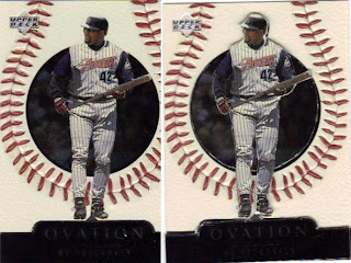
Next, I decided to do a 3-card project to show some of the depth you can get. For this project, I found three Mo Vaughn 1999 UD Ovation cards. This project is a little more complicated. As I looked over the card, I knew I wanted to leave the already-embossed stitching alone. So, that only leaves the circular 'fans' and Vaughn himself. There is the banner at the bottom, though, too.


Remember, the more cards, the more planning. So, here is what I wanted: Vaughn to be at the most-forward position, the crowd behind him, then the base card. The banner at the bottom could be either one or two 'stick-ons' deep. I opted for just one stick-on because I wanted Vaughn to be the thing that sticks out the most.

I set the base card aside. Card #2 became the basis for the crowd. Notice how the background is basically a circle. Perfect. I cutout the circle as best I could. Remember, Vaughn will be in front of any places you might cut off his head or other body parts, so you do not have to worry with that right now. I also decided to cut the bottom banner off this card.

The next chose was cutting Vaughn out of card #3. I found the easiest way to do this was to discard anything that was "not Vaughn" and not worry about the 'cleanliness' of the remains. After all, it was the guy in the center I was after. Ideally, I would have taken time to cut out ALL of the background parts. You can See in the finished product, I did not remove the crown between his right arm and body. Honestly, I don't think anyone noticed.

Now for assembly. I attached the circle and the banner to the card. Then, I placed Vaughn on top of the circle, aligning things as best I could. The scan of this card shows the 3D effect much better than the 2-card method because it is literally more 3-dimensional.

Again, I put the cards side-by-side in a single scan so you could see them next to each other:

If so desired, slip the finished product into a penny sleeve for safe-keeping.

Why would you want to more than three cards? I was hoping to find an example, but couldn't in time to get this posted for tonight. But, several ideas come to mind... You could use one to make a 3d border (Say, for those 1990's Donruss we all have), then use other cards to create the 3d effect. I think you could also use cards to layer in the background crowds, etc. For example, let's say you have a card with the player in the foreground, a bit of field, the dugout, and two tiers of fans visible. Starting with the fans near the top of the card serving as the base card, you could build a card that gradually 'popped' out to the viewer. Depending how complicated the build, you could even preserve the border each time and end up with a diorama-type project all in a 2.5"x3.5" space. I'll keep searching for dupes and see what my daughter and I can come up with (my son was none too interested in this project, though I caught him pairing up his Pokemon cards into dupes....).

Tuesday, November 4, 2008

1993 Stadium Club First Day Issue

This is an early example of baseball card companies trying to create scarcity in a product this is produced like a commodity. In 1993 through 1995, and again in 1998 to 2000, Topps put a foil label on the Stadium Club cards they made on the first day of issue. I have no doubt (not much anyway) that the cards so labeled were actually made on the first day but really, what difference would it make. I'm sure Topps got this idea from the postage stamp collecting world where first day covers are a big collecting item. In that world, a big deal is made of the first day issued stamps as usually they come on a post card or envelope which is canceled with a special stamp showing the date.

Topps idea in 1993 was to put the FDI stamp on 2,000 cards. Beckett lists these as being worth 8 to 20 times the base card. It also says to beware of transferred FDI logos. I know mine are genuine because I got them in a pack. They were seeded into packs a 1:24. Did they really only produce 2,000 sets on the first day?

In the 1998 to 2000 run, they upped the ante on these. In addition to the FDI logo, the cards were numbered, for example, to only 200 in 1997. Did they really only make 200 sets on the first day? Are these the first 200 sets made? Who knows? Who cares? In 2000, there were also Stadium Club Chrome cards, and FDI Chrome cards. I actually have a First Day Issue Stadium Chrome Refractor card, numbered to 25. Unfortunately, it's only Ryan Klesko, but Beckett says it's worth $20. The 2000 cards don't have a gold foil logo like the earlier cards. It has "First Day Issue" printed in gold foil. Probably harder to counterfeit.

Monday, November 3, 2008

A-Mays-ing Pull

As I'm sure most people in the blogosphere know, I pulled a Willie Mays materials card numbered 02/10. This was a fantastic pull and I couldn't be happier with it. Which is why it's up on eBay right now.

I'm very happy with it, but it doesn't fit into my criteria of collecting and I can possibly put a small dent in my wedding fund. So, ultimately, I'm happy with the card for many reasons.

For me, this will probably be the best thing I ever pull. I don't normally buy high end boxes. Every time that I have purchased upper mid level boxes, I have been burned. Plus, I don't have the funds to essentially waste on product of that nature. Sure, it's fun, but I can get more bang for my buck busting other products.

When I was a kid, I dreamed of playing in the majors. I dreamed of hitting more home runs than Carlton Fisk in a season. I dreamed of passing Hall of Famers, one by one, on the home run list. I always thought that when I passed Willie Mays, I would consider that my greatest achievement. I thought that if I could catch Hank Aaron, that would be wonderful, but I would happily settle for second place.

This card instantly brought memories of those childhood daydreams. That is worth the price of admission, for me. I hadn't thought about those pipe dreams in a long time. Baseball and baseball cards should bring out memories like that. It's part of the reason why we collect into our adulthood. We strive to feel as secure as we did back then. When the biggest problem in our lives was trading a Dave Winfield card for a Cal Ripken Jr.

Cards like these bubble those feelings to the surface. This is one of the main reasons why I collect. The feeling I got when I saw this card out of the pack could not be accurately measured with any scientific device. There aren't many things that will make me feel like a kid again, but this pull is definitely one of them.

For those who came late to this site, and haven't checked out the archives, this site started out as a showcase for my pulls and for damaged cards that I ran across. It emerged into a site that featured every imaginable concept put to cardboard. Then it expanded even further with great writers joining the family here. I thank every one of those writers for contributing what they have. They have taken this site to places that I couldn't have imagined back in January.

If you would've told me twenty years ago that I would have a card with a Willie Mays uniform in my possession, even for a short while, I wouldn't have believed you. This card has brought out my childhood and brought out the responsible adult. The kid in me doesn't want to let this card go, but the adult in me is willing to sacrifice the card for the big picture. I'm just happy that the kid in me had a little fun before the adult took over in the decision making process.

Sunday, November 2, 2008

Size DOES Matter


Take a look at the photo above. What do you see? A couple of Indians cards, a Pirate, a White Sox player... What else do you see?

The Doc Edwards card on the left is a "standard" sized baseball card. Everything else is all over the place. We have big cards (like the 1980 Topps Jumbo Tekulve), we have "oversized" cards (like the 1989 Bowman Allanson). There are "oddball" cards with sizes that could be anything (1995 Classic Phone Card Frank Thomas), and we have "throwback" cards like the 2008 A&G Hafner and the 2007 Goudey Sizemore.

We have seen cards on this blog that look like bookmarks, posters, you name it.

What's the big deal, you ask? For a collector, size can be a very big deal. At some point in history, when cards had come to the 'standard' size (usually 2.5 inches by 3.5 inches) someone realized you could divide a page up into 9 pockets and fit 9 (or 18 if you went back-to-back) cards into a 3-ring binder! Brilliant!

But then, we had to stop and think about the T206's we have, or the other non-standard-shaped cards. What do we do with those? Well, eventually, companies like BCW came out with pages to accommodate most sizes out there - 4x6, 5x7, 8x10, coins, bookmarks, minis, micros, etc.

Different sized cards are not a new thing by any stretch. Before there was even a such thing as a 'standard' size, candy and tobacco companies made cards to fit in packs. And then, as the creative teams at various companies came up with new gimmicks, size got put on the back burner. There are 1975 minis and Pacific micros, Topps jumbo posters and Pinnacle 5x7 "card-in-a-card" types. Heck, Pacific even came out with a card in the shape of a BOX, for crying out loud (for reference, see 1988 Pacific Aurora).

All of these 'innoventions' are great for the hobby in general, but can drive some collectors to start collecting liquor bottle labels instead of cards.

And just think, I haven't even started talking about how the THICKNESS of a card affects collectibility.... With all this talk of size and thickness, it's a wonder this post isn't being marked as SPAM...

Are the card makers and the pocket-page manufacturers in cahoots with each other? That may require some further investigation.