Tuesday, August 28, 2012

A Homemade Shadow Box Card

I was flipping through the card boxes at Uncommon Sportscards and some of the cards are in those unbelievably huge screw down cases that would often hold 1990's junk wax.  As I flipped it over I was a little confused but the plot thickened.


I didn't remember Wilson Alverez having one of those cards like Rickey Henderson's 1991 Upper Deck card which showed Rickey in motion on a single non-3D card.


Instead upon closer inspection it turns out someone had three copies of the Alverez card and decided to make their very own shadow box cards.  Each version of Wilson seems to be delicately cut out and glued on top of one another.


Here's a close up on three Wilson faces on top of each other:


And here's the card's reverse side which was unaltered.


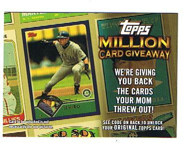
In the end, I delicately placed this masterpiece back into the box after photographing it and so you can sort through the many boxes at Uncommon Sportscards in the Twin Cities it can be yours!

Sunday, August 26, 2012

Tony Micelli 1982 Fleer Mock Up

When I ran across this picture of actor Tony Danza, I suddenly remembered that his character on Who's The Boss was an ex-ballplayer. This is what I get for doing homework in front of the television as a child. Random pop culture facts speed to the front of my thoughts as if the synapses cannot be bothered with trivial things like pin numbers and passwords. Nope. Tiny little details from eighties sitcoms are much more important than those.

Basing this card on the timeline of the show (although the sitcom never actually specifies any date), Tony played with the St. Louis Cardinals at second base until a shoulder injury forced early retirement. The show started in the fall of 1984. September 20, 1984 to be exact. I figured two years would be a plausible enough amount of time from injury to rehab to retirement to searching for a better life for his daughter by looking in the want ads for live-in housekeeper in a more upscale environment than Brooklyn. It sounds about right to me, at least.

This photo screamed 1982 Fleer, so that became my focus. The odd angle, weird positioning and lens flare really captured the top notch photography that marred the early Fleer sets. The out of place coloring on the "uniform" seems about right for the sometimes spotty photos from these sets too.

Tuesday, May 15, 2012

Cross-post: White Sox...Baseball Cards???

This is a cross-post from my new blog, Chipp' 'n' Dale http://thehomeofthebraves.blogspot.com/.
It was originally posted 5/11/12. 


Signed the little brother up for the (free) Chicago White Sox Kids Club for this year. I think I sent in the request in February or sometime then. Just yestiddy, though, we received a packet in the mail from the Sox. When asked if he wanted the swag, my brother gave a conclusive "no." It had some interesting things, actually, like this Paul Konerko "Fathead" sticker thing. The Sox logo and kids club logo are also stickers.
A membership certificate "signed" by Southpaw, the White Sox mascot...

Some ticket vouchers for nosebleed seats at a White Sox home game, and a "Take a stand against Bullying" postcard....

Oh yeah, and some eyeblack stickers. Don't wear those for NCAA Football, though, kids!

A flyer for the White Sox and Bulls Summer Camps, aka "Jerry Reinsdorf Little League pro day."
But here's the real goody. A White Sox sticker page! Think 2012 Topps stickers, but a team issued set of players! (They're small in comparison to cards, too.) And check out the design!

VS.
1987 Donruss, anyone?! The design used for the stickers is actually a nice spin-off, I think. Sharp team colors, and a conspicuous absence of that 1980's look of red, white, and...navy? Cool stuff.

So that's that. Wouldn't find this in a fan pack! Definitely some cool stuff, and hey, who would've known there's a throwback team set that's not from a Topps year design?

Tuesday, April 3, 2012

HE'S BURNING BASEBALL CARDS!

I don't know whether to laugh or cry...


This makes me kind of sad, especially since this is one junk wax set I'm trying to collect...


From this guy's "About" page:


"To increase collector’s interest and long term value from the overproduced era these cards need to become scarcer. To reduce the number of cards in circulation, large volumes of these cards simply need to be destroyed. Starting now, I am taking action to reduce the number of 1987 Topps Baseball cards in circulation...To reduce the numbers I will be destroying 1987 Topps Baseball cards every week...in my fireplace. All 1987 Topps Baseball cards I acquire will be destroyed. This includes All Stars, Rookies, and even Graded Cards. To be clear — no 1987 Topps Baseball card is safe."


AAAAA!!!!!

I couldn't do that to innocent overproduced Topps cards...Maybe this guy is just braver than me...or more foolish!

Thursday, March 15, 2012

Whoa.

Went to my (relatively) local card shop a day or two ago, Champ Sportscards in Huntsville, Alabama. The store was great, and the shop owner, Brooks, was friendly as I asked him some general questions about his shop and business.


One of the things I thought was awesome about the store was that there was a box full of 1961 Topps and 1962 Post (previously reviewed here). The 1962 Post set was really cool to me, especially. Ended up with these two cards from that box that included Orlando Cepeda and Maury Wills...


Harvey Haddix card. If you're a real baseball fan, you know his story. (I actually managed to squeeze this card into a penny sleeve, not so with this next card.)As soon as I saw this one, I had to have it, forgoing the one with a Giants player with a rip across his face. The (hopefully) kid that did this back in 1962 gave Ron Hansen a ski-mask-looking thing over his face, and a "beany." Ron is exhorting us to look at his "cop." I assume that by "BALLS" the kid was referring to Hansen's eyeballs. That's just a guess, though. [the middle bubble reads, "Tweet," referring to Hansen's status as an Oriole] The corners are horrendously worn, making my efforts to put this in a penny sleeve hopeless. The card is also heavily creased, as you may be able to tell.


However, this was a terrific card, and the Haddix balanced out the eccentricity of my purchase. The total price for both these?


Three dollars. (By the way, I also snagged a Curt Schilling Donruss RC, Brandon Hicks 2010 Chrome RC, a Glavine, and a Cardinal-jerseyed Smoltz for $2. Total.)

I love this hobby.

Monday, March 12, 2012

1990 Upper Deck Baseball stickers

May it first be noted that this, being the fifth post of 2012 on TDTC, marks the passage of lasts year's post mark of four! Progress! Here, now is Upper Deck's 22 year old foray into team stickers. Shiinneee...These actually scanned surprisingly well, considering how hard it is to see them. Best I can tell, these were inserted one per pack of 1990 Upper Deck.


A Pirates sticker here-Each sticker is a little bit like "A history of MLB logos". Pirates fans, did that particular scalawag have any sort of nickname/existence as a team mascot? Jess wonderin'...


St. Louis Cardinals sticker. The back of the sticker is a blank white back. Yawn...I actually have a nice stack of these hologram stickers-maybe I could use them as trade package throw-ins. Unfortunately I do not have the Braves version of this sticker-anyone care to help me out there?


This card is sorta creepy. Apparently Chief Wahoo has gone...3-D! Considering this was 1990, this is like, bangin', cutting-edge technology! Amazing! (Looking back, Mr. Cardinal seems to have this 3-D form too. Cool, I guess. (Picture 1990 kid pulling Mr. Wahoo here: "Buzz Hype, yo! Man, that is clean!!!")


Last, I post a Cubs card. I posted this mostly because I have like 5 of them I don't really care for. (Picture afore-mentioned 1990 kid: "I have like, five of these Cubs hologrammies. Buzz kill, man!)Any diehard Cubs fans want these? (I know you're out there.)


So there you have it. 1990 Upper Deck hologram stickers! I frankly have no idea what a kid in 1990 would have done with these. They're not by any means something you stick on your car bumper (though that would look awesome to have the entire back of your car a giant hologram, ...right?) They're just...shiny. Huh. Well, anyway, 1990 UD holograms, everybody! (Let's bounce on outta heah, ya'll!)


Tuesday, February 21, 2012

Spring Training Is Here!


Quite a few baseball cards depict players in spring training. This is for two reasons: First,


it is easier for photographers to get close to the players when they are playing meaningless games than when they are, and also to get shots of players in new uniforms (See 2008 Tampa Bay Rays Upper Deck cards) or posed shots for various sets. The alternative for this second reason is airbrushing, which is a whole 'nother story.


Along with this rather random Trot Nixon card, here is an interesting poem I came across that seemed appropriate for today.


William Carlos Williams, "At the Ball Game" (from Spring and All)


At the Ball Game


The crowd at the ball game

is moved uniformly


by a spirit of uselessness

which delights them--


all the exciting detail

of the chase


and the escape, the error

the flash of genius--


all to no end save beauty

the eternal--


So in detail they, the crowd,

are beautiful


for this

to be warned against


saluted and defied--

It is alive, venomous


it smiles grimly

its words cut--


The flashy female with her

mother, gets it--


The Jew gets it straight--it

is deadly, terrifying--


It is the Inquisition, the

Revolution


It is beauty itself

that lives


day by day in them

idly--


This is

the power of their faces


It is summer, it is the solstice

the crowd is


cheering, the crowd is laughing

in detail


permanently, seriously

without thought


We're underway with the 2012 baseball season everyone! Go Braves!

Saturday, February 4, 2012

A Quandary, A Dilemma, A Bind

I was going through some junk wax today and saw some old acquaintaces, some 2010 Topps Million Card Giveaway cards.This was before I was as connected with bloggers who use these codes, as I am now, and sadly these cards were useless to me or anyone else and then expired. Surely they have some purpose?


Hmmm...Let's experiment with this here card. This is a 2010 MCG card of Ichiro Suzuki. Incidentally, my good friend Wikipedia tells me that Ichiro's manager in 1994 was the one who convinced him to put "Ichiro" of the back of his jersey, instead of "Suzuki." Apparently it was part of some marketing deal. I dunno, it kind of annoys me that on all his cards he is referred to as "Ichiro." I mean, Albert Pujols has both names on his card. Should he have just his last name on there (or first?) Hm. (Does Ron Artest have "Metta World Peace on his basketball cards? By the way, I always read "Metta World Peace" with a deep voice.)


Using the awesome power of my (other) good friend scissors, I lopped and cropped Ichiro out of his tilted posture to this:


I know what you're thinking-I lopped the bottom part off. I didn't; it just scanned funny. It actually has "ked is not" slanted across the bottom, which is awesome.


In conclusion, I really don't know what to do with these. Still. What I'll probably end up doing with them is using them for 'dummy' support cards in trade packages...or something. I'll try to avoid cutting them up anymore. No promises though.


What about you-any similar situations like this?


Tuesday, January 31, 2012

Topps Comes Through (?)

More like a "Things Done WITH Cards-style post here today, boys and girls. Here we go...

One day, many moons ago, I found that our beloved Topps Company offered, and still does, a "No Purchase Necessary" deal. How, you may ask, does it work? By digging out my magnifying glass, and squinting at the fine print, here's what I found.... "For the chance to obtain any of the cards above, (inserts) at the same odds, (from 1:3-1:40,000-there's a yeah, right insert for ya) while supplies last, hand print your name and address on a 3 x 5 card (What if I do it an a 4 x 6 card? Will they refuse to mail anything to me?)

and mail in a #10 envelope to NPN 2011 Topps Baseball...etc, etc. Only one card per envelope, mailed separately, (eh?) postmarked by November 16th, 2011 and received by November 23rd 2011..." and then it talks about how you must do a multiplication problem too if you are of Canadian descent. Yeah, sure, okay. This I did, I mailed a card in a #10 envelope, and waited. Last week, lo and behold, I received a small manila envelope.


What could be inside?


Oh, wow! It's an insert card of recently-alleged-steroid-user Ryan Braun! Cool!


Two days later... (Yes, I did this for Series one and two...I'm just crazy that way...)


Same deal with a small manila envelope and....


Ta-da! A Bob Feller 60 years of Topps insert!


So what do you think? Is this some sort of out reach thing by Topps for poor kids without 2 bucks to buy a pack of cards with? I really wonder if any actual card collectors do this...Anyone? Any and all feedback from you all would be welcomed.


Thursday, January 26, 2012

The Team Card

For my inaugural post as I try to help resurrect TDTC, I have for you an exposition of the "small stuff" team card. Above I posted an image of a classic team card, the 1961 Detroit Tigers Team Card. This card sort of embodies the KISS model to me-the whole team, right there. Lately, though, especially in the years that I've started collecting (2008, 2010-2012) there's been some messing with that formula by Topps and Upper Deck. Take a look.


Here's a classic card for you. The Diamondbacks, one of the newest franchises, congregating for the timeless team photo in the bleachers. Some of them are even smiling. Imagine that!


Very next year-WHAT?!? Upper Deck portraying Scott Rolen on more than one card in a year set is enough for me to with they were out of the baseball card business! (A quick glance at the back, however shows that the next best player on the team at the time was...uh...Alex Rios. Never mind.) Anyway, there's one example of the "team" card...a player fielding spring training grounders. Any Jose Bautista Blue Jays from you in the comments section might make this a tad less awkward.


Speaking of less awkward, here's another "team" card. Tim Lincecum and...someone else. Better...but still feels like a representative sort of effort. I don't know that I like that. Why not just do away with the team card and have two player cards from this angle? On to the next card:


Here's the 2011 Topps rendition of the Detroit Tigers team. Brennan Boesch and Miggy Cabrera. I still really don't like this. Is Topps implying that the Detroit Tigers play with two players every game? On another odd observation (maybe Topps really does have too many inserts this year) these guys probably have a Diamond Duo insert somewhere...


Here's a slightly more classic example. You know what, this feels about right. It's not posed, per se, though they are smiling for the camera, and they've obviously just wrapped up a game, so they're all in uniform and (presumably) smiling after a win.


So there you have it. Here's a final Topps Heritage classic version team card.


I had a couple of other 2011 Topps cards with more players in the shots, but the White Sox card really seemed best to me. Another card I didn't post was the 2010 Tigers "franchise history" card, which (I think) showed a statue inside the ballpark. Hm. Somewhere, there's a fine line between cards in a Baseball set, and promotional cards you get in a fan pack, I think.