Showing posts with label Topps. Show all posts

Saturday, February 23, 2019

2019 Topps Now Manny Machado Relic

I like the idea of Topps Now. It's basically a card on demand system that allows you to order cards of selected events for a 24 hour window. Nice, huh?

Recently, Topps Now has gotten parallel crazy, much like their brick and mortar releases. This card is available in regular for $9.99. It also has relic parallels.

A relic parallel numbered to 99 is $39.99. A relic parallel numbered to 49 is $69.99. A relic parallel numbered to 25 is $99.99. A relic parallel numbered to 10 is $149.99. A relic parallel numbered to 5 is $249.99. A relic parallel numbered to 1 is $799.99.

Did I mention that the relic is a tablecloth?

RANT MODE ON:

Of all the idiotic, stupid, money grabbing schemes that Topps could think of, this one takes the cake! I understand game used items. It's part of the appeal of getting closer to the game. Uniforms, bats, bases, and dirt. These are all things that either were used in a game or had the potential to be. I can even see stadium seats, since that is an integral part of the game experience and the ambience of the sport. But a tablecloth that was used at the announcement of a signing? What idiot thought this was a good idea? What possible connection does a tablecloth have to the game. If you want to have a connection to a player at a major signing, take the uniform jersey that he was wearing, not the tablecloth. Did someone eat paint chips as a kid? Who the hell thought this was a good idea? They should be suspended. This relic makes me want to have a picnic, not see a baseball game.

RANT MODE OFF:

I'm glad that Manny Machado did not sign with the team I follow. I would not want to feel at all compelled to entertain the thought of purchasing this relic to complete a collection. This is probably one of the stupidest "relics" I have seen. It makes of mockery of the entire relic system. The only reason for these cards is a quick cash grab. I'm not going to judge if you want one of these cards. That is your personal preference. I just don't see a reason for it.

I'm all about living in the moment. I love the idea of Topps Now. This is a monstrosity. A travesty. A disgrace to card collecting. Those are just my thoughts, though.

Saturday, February 4, 2012

A Quandary, A Dilemma, A Bind

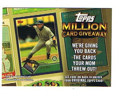
I was going through some junk wax today and saw some old acquaintaces, some 2010 Topps Million Card Giveaway cards.This was before I was as connected with bloggers who use these codes, as I am now, and sadly these cards were useless to me or anyone else and then expired. Surely they have some purpose?


Hmmm...Let's experiment with this here card. This is a 2010 MCG card of Ichiro Suzuki. Incidentally, my good friend Wikipedia tells me that Ichiro's manager in 1994 was the one who convinced him to put "Ichiro" of the back of his jersey, instead of "Suzuki." Apparently it was part of some marketing deal. I dunno, it kind of annoys me that on all his cards he is referred to as "Ichiro." I mean, Albert Pujols has both names on his card. Should he have just his last name on there (or first?) Hm. (Does Ron Artest have "Metta World Peace on his basketball cards? By the way, I always read "Metta World Peace" with a deep voice.)


Using the awesome power of my (other) good friend scissors, I lopped and cropped Ichiro out of his tilted posture to this:


I know what you're thinking-I lopped the bottom part off. I didn't; it just scanned funny. It actually has "ked is not" slanted across the bottom, which is awesome.


In conclusion, I really don't know what to do with these. Still. What I'll probably end up doing with them is using them for 'dummy' support cards in trade packages...or something. I'll try to avoid cutting them up anymore. No promises though.


What about you-any similar situations like this?


Saturday, August 22, 2009

1982 Topps Squirt Bottle Tags


In 1982, Topps teamed up with Squirt to create a scratch off game where people could win $1000 in groceries, plus get a collectible trading card to boot! The game pieces had a circle that could be punched out in the top section, then those placed on the necks of Squirt bottles. Somehow, the one I ended up with is not punched!

The cards feature the trademark yellow and green of the Squirt bottle's colors. For those that have never heard of Squirt, it was kinda like Mt. Dew, but not. Do they even make Squirt anymore? I have no idea. The entire piece is about 9 inches long and about 2.5 inches wide. The card itself is standard width, but about a half-inch or so short of a standard-sized card. The stock is about half the thickness of a regular card. A quick search on eBay revealed that another variety of these features two players instead of a player and game card.

Here is a close up of the Gary Carter (#19 of 22) card:


And, I scanned the back of the card so you can see what it looks like as well:


As you can see, Topps may have come up with an original design for the front, but the back is all '82 Topps. In fact, if I were a betting man, I'd bet it is the back of his '82 Topps card. Although, the "Jim Palmer" fact on the right at the top looks way too typewritten to have been on the real card. I could be wrong. I don't have an '82 Carter to compare this with.

As mentioned before, Carter is #19 of 22 cards. Here is the whole checklist:

1 Cecil Cooper - Milwaukee Brewers
2 Jerry Remy - Boston Red Sox
3 George Brett - Kansas City Royals
4 Alan Trammell - Detroit Tigers
5 Reggie Jackson - California Angels
6 Kirk Gibson - Detroit Tigers
7 Dave Winfield - New York Yankees
8 Carlton Fisk - Chicago White Sox
9 Ron Guidry - New York Yankees
10 Dennis Leonard - Kansas City Royals
11 Rollie Finger - Milwaukee Brewers
12 Pete Rose - Philadelphia Phillies
13 Phil Garner - Houston Astros
14 Mike Schmidt - Philadelphia Phillies
15 Dave Concepcion - Cincinnati Reds
16 George Hendrick - St. Louis Cardinals
17 Andre Dawson - Montreal Expos
18 George Foster - New York Mets
19 Gary Carter - Montreal Expos
20 Fernando Valenzuela - Los Angeles Dodgers
21 Tom Seaver - Cincinnati Reds
22 Bruce Sutter - St. Louis Cardinals

Sunday, August 2, 2009

Games in a Pack

Note: the bulk of this post is paraphrased from my post about the "Pirates" pack featured on "A Pack to be Named Later." I have added some thoughts and additional information for this blog. It's not exactly the same post! --David


Wiz Kids Games (an apparent subsidiary of Topps), provides many of the "game in a pack" fodder that one might encouter during a trip to one's favorite (or highly loathed, whichever) retailer.

These packs include everything needed for two people to play a game including punchout pieces which often require assembly by very nimble fingers, one or more dies, instructions, and other items that may or may not be needed for gameplay.

Some titles include: "Nascar Race Day," "Star Wars Pocket Model TCG," Pirates," and others. They also make the "Action Clix" games, but I have not bought any of those as of yet.

For the purposes of this post, as mentioned above, I will examining a pack of "Pirates" cards. I do have a "Nascar" pack that will appear at a later date on "A Pack to be Named Later" as well.


Each pack is a complete Pirates game (with two ships, a die, rules, etc). In order to really show these off, I scanned both sides of each playing card and then combined those into a "Side 1, Side 2" picture.

Each card is about the size of a regular/standard trading card, but is the thickness of a credit card. That's a good thing, because the assembly is a TINY feat, and anything thinner would tear like toilet paper.

First up, we have a "Firepot Specialist." The card comes with a punchout square 'special piece' and two punchout smoke-thingies:


Next, we have our first ship, Dark Fox, which bears something akin to an oldtime US Flag. Before you ask, YES, you have to punch out everything and assemble the ship. And, YES, after you punch out the pieces, they are TINY:


Here we have the booty: a series of coins (worth the amount printed on the back) plus a special coin to be used during gameplay (assuming you make it that far):


Next, is part two (because Blogger loads pictures in reverse order and I didn't realize this was #2 until writing this), of our second ship, Hangman's Joke. Why part TWO? Ah, you see, some ships are more complex and require two playing cards to complete. See? Aren't we having fun?


This is part one of the Hangman's Joke ship. The little brown wavy things are little flags that go on one of the masts. I assume they give you three because they know kids are going to lose these and come crying to their parents...


Assembling the ships not only requires you to punch them out of their cards, but to also be able to line up and insert tiny tabs into tiny slots (please reserve all crude comments for the tavern). Because these are pirate ships, they are also curved, making it that much more fun to assemble.

The little flags that hang off the back of each ship is very small, and will most likely be the first pieces lost after a few rounds of play.


Here is a special card, "Trogs." If you play this card, you get all the booty from a plundered ship. Very nice! I need to find some of these guys for a project I have around here...


And the last card in the pack is the island, because you can't have pirate treasure without an island to bury it on, right? Er, well, more accurately, to DIG IT UP from...


But, WAIT! There's more! In addition to the cards, each pack a set of "Quick Rules." These give you enough to play a scaled down game without concerning yourself with things like Trogs.

The Quick Rules provide a picture-based step-by-setp guide for assembling the ships and for playing a beginner's (or basic) game. It's pretty easy to follow.


Included in the pack is a mini-poster advertising the upcoming (back then) online PC game based on the cards (or vice versa, does it really matter?)...


We also have a copy of the Full Rules for the Complete Game. I was tempted to open this thing up and show it to you, but if you really want to know that badly, go buy a 99-cent pack at your local Target. This game can get seriously complicated. I'm not sure how many kids will stick around for a full game...

The full rules are much like reading a recipe in which you have an idea as to what you are making, but really, you've never heard the ingredients written out quite like this. A quick looksie, and this game is like "Axis and Allies" in a wax pack...


And here we have the die that comes with the game. I used the ubiquitous US Quarter for sizing reference. It is "Small... esS... emM... All... Small!"


There is also a foldout checklist, in case anyone in their state of insanity wanted to collect every piece of the game. What you see here is page 1 of 4, and it is the size of a baseball card.


And, in the name of integrity, or something, I punched out and assembled the game pieces. There was no good way to get a picture, so I set up a mock game with the instruction books serving as backdrop...

My sincerest condolances to any parent out there who had to endure putting these things together for their child. And if you bought these yourself, then you got what you deserved. In all honesty, though, the game DOES look kinda fun...

Saturday, June 20, 2009

Red Pen Alert!!

I would love to peek inside of the mind of a child. It should be filled with fantastical ideas and wonderment. I'll bet that all the world's problems could be solved by looking at everything through a child's eyes. Only then, might I be able to appreciate the added artistry of this card to its full potential.

If an adult did this butchery, I would think that they were either, drunk, high, Forrest Gump or extremely bored and distracted. What did poor Al Weis ever do to the person responsible for this masterpiece?

As you can tell by the scan, someone really loves the red pen. The words "White Sox" are helped along by a red ink stripe that isn't quite level. The "Sox" logo on the hat is filled in with red ink. The Topps 1963 All-Star Rookie trophy has changed from a yellow to a somewhat carefully lined red ink.

Al's eyes are mostly reddened and he's sporting a wonderful loopy red five o'clock shadow. He almost looks like the caricature of an old timey robber. Completing this outfit are streaks of red on each sleeve. The right side of Al gets the broad strokes of red ink, while the left side seems to suffer from a smudgy transfer.

Tiny red dots make an appearance just below the H in White Sox, under the newly red banner. There appears to be red across the field behind Al, but that is not red ink, that is actually part of the picture. The dirt between the field and the stands just shows up in a reddish hue.

Lest red be the color of choice here, blue ink makes a subtle appearance. There is a mostly vertical straight line coming down onto Al's left shoulder. Curiously, the puzzling part of the blue ink comes just underneath Al's belt line. Can this be a clue into the mind of the inking artist?

It looks like "ISJ" written in blue ink over Al Weis' lap. What does it all mean? One can only speculate the meaning of this. Perhaps this was the artist's initials? Maybe it is a crudely written infinity sign. Could Al Weis be infinity? Since Al was on the White Sox and the 1969 Mets team, could this be a Cubs fan's revenge on Al?

We may never know the answers to this doctored card, but we can appreciate this as an interesting artifact from (hopefully) a child's mind.

Sunday, May 24, 2009

Duo-Tang Topps Sports Shots Binders/Portfolios


I know what you're probably thinking... "What a horribly off-center 1989 Topps Strawberry you have there, Tribecards!" Unfortunately, you'd be wrong. You see, what you have here is a scan of a Duo-Tang Binder/Portfolio (like they sell to kids at Wal-Mart at the beginning of school to keep papers in). And the photo above is the best fit I could get the thing to stay on my scanner. To see how this ginormous 'card' compares to a standard-sized card, take a look at the next scan:


If you look very closely, you will see a standard-seized baseball card in the upper left corner. See it way up there, looking like some kind of "Fan Favorites Mini" card? Yeah, these binders are BIG, though flat with pockets in them.


Duo-Tang and Topps teamed up before with a 1988 set as well, as seen above. The binders/Portfolios measure 9-1/2" by 11-3/4" and are cardboard.


The 1988 set featured 130 players total. Some of them include Joe Carter, Robin Yount, Nolan Ryan, Tony Gwynn, Carlton Fisk, etc.


In addition to Molitor and Strawberry, the 1989 set featured players such as Doc Gooden, Mark McGwire, Ozzie Smith, George Brett, etc. The set was greatly reduced from 130 players down to 39 that year.

If there is great interest, I can post the checklists for each year, but you can find singles and 'sets' on eBay. Most of the sets you find for sale are actually compilations that someone else has assembled. The originals were sold in 50-piece boxes for retail stores to sell for $1 each. I don't even remember how I ended up with the ones I have... They will eventually be given away during one of my free-for-alls.

Thursday, March 12, 2009

2009 Topps Wal-Mart Black

This year, Topps tried to go stealth on us. In April, Wal-Mart was supposed to sneak indistinguishable blasters into the mix with the regular 2009 Topps blasters. Well, Wal-Mart being Wal-Mart decided to mix them in a month early.

While the product reached the shelves unannounced, the immediate reaction was mixed upon the card collecting community. Some were elated. Some were confused. Some were mad. Some even tried to make a quick buck on eBay.

After the initial dust had settled, Topps in a rare openness, revealed the information about this variation. They included the UPC numbers that identified the blaster as having "black" cards. Topps also confirmed that a different variation was planned for Target stores and gave the UPC numbers for that variation.

I think Topps did the right thing when first confronted. Normally, the word would be deny, deny, deny. I, and many others, appreciated the honesty and frankness of Topps. This makes the madness of a variation project like this, fun and smile inducing.

As for the cards themselves... they look great, in person. They don't scan so well, but they scan well enough. Some people have nothing better to do than to put the cards up to their nose and sniff. There is a faint odor to the cards, but you really wouldn't notice it unless the card was millimeters from your face.

The cards look absolutely gorgeous. The background is darkened and the player is not. This creates a spotlight effect on the player. The result is spectacular on most cards. How would you like to be facing Greg Maddux highlighted, while everything else is blackened? His fastball about to come out of his hand looks fierce. Greg looks scary, as everything else is gone. I would not want to face him in this scenario. Truthfully, I wouldn't want to be in the batter's box against Maddux in pristine conditions. This would scare the life out of me, if I was a batter!

Thursday, January 15, 2009

A Charlie Brown Christmas Tree Equivalent

Over the holidays, I received a huge stack of cards from dayf that were unfortunately damaged during transit. About the only card that wasn't damaged during the trip from Georgia to Illinois was this 1954 Topps card of Fred Marsh. It had the pleasure of already being damaged goods!

Seeing cards like this one make me want to invent a time machine, just to see what happens to these cards during the course of their lives. This 1954 Fred Marsh must have one great story to tell.

The corners are worn away. There are pinholes in the cardboard. Nicks, chips and creases abound! There are even two holes in Fred's neck! This card has seen a lot of history.

There is a card wide crease right under Fred's eyes that seem to prop up the crow feet around the eyes. There are scuff marks along the edges that suggest this card may have been part of some baseball card war. Perhaps even thrown into a pile of bicycle spoked tragedies.

It's dirty looking. Scruffy looking. A poor man's near Picasso. Despite it's flaws (or maybe because of them) it is now one of my favorite cards.

Wednesday, October 8, 2008

A 1957 Art Project

Interesting things keep popping up in my e-mail lately. The latest one was a chance to review a website for facial tics caused by Tourette's Syndrome. I could either take my payment through a PayPal payment or a free sample of the product. I kindly replied that this was a website for sports cards and this was not the proper venue to do that. I never in a million years, would think that someone would mistake this site as a site to review medical scams, but whatever.

A slightly older e-mail popped up with a link to an eBay auction with this card. The auction is now over and I have no clue as whether anyone actually bid on this unique card. I'm too lazy to look it up. The auction listed the card as "likely a kid's art project" and urged people to purchase it based on that fact.

It was refreshing to see someone actually try to sell something "as is" and not try to pass this off as an error or an employee prank.

Someone took a 1957 Topps card of Ralph Terry and attached a cut out head of Mickey Mantle to it. To add insult to injury, they scratched out Ralph Terry's name and position and wrote (in pen) Mickey Mantle and his outfield position. Truly this is the work of some visionary. The only thing missing is the replacement of the number on the back.

I'm sure the world is littered with examples such as this. You know what? That's great to see. It gives us a peak into the mind of a mystery person circa 1957. Plus, it gives us something fun and interesting to look at today. Long live Mickey Mantle, the big headed pitcher!

Friday, August 1, 2008

1988 Topps Mattingly in 3D


This is something special I whipped up on my own. This is a three-dimensional stereogram, meaning that if you blur your eyes and fuse the two Mattingly cards into one, you can see some 3D effects. I put the "Yankees" name far into the back, the Mattingly name banner and Topps logo into the foreground, and made a few other little changes. If you focus on the purple border to the card, get that solid, you should easily be able to see these other changes.

Enjoy!

Monday, July 28, 2008

Beware Of Bootlegs

What do you get when you have a really hot, popular player left out of a card release? You get a poorly done bootleg card! I acquired this card somewhere around 1990 at a card shop that no longer exists.

I knew it was a bootleg, just by looking at it. I knew Will Clark did not have an Olympic card in the 1985 set. I just wanted it to show to all my friends. I did. They all said that they didn't know that card existed. I said that it doesn't because it's fake! I think that impressed them even more.

There were several things wrong with this card besides the obvious fact that it wasn't in the actual set. The graphic looks like it was produced on a low end printer. Those two facts sent red flags up even at the young age of 13.

When I got the card in my hands, the card stock felt completely wrong. Not only that, it just didn't look right. The back didn't even try to pass itself off as Topps. It tried to pass itself off as an "Official USA Olympic Sponsor Card". It never said sponsor of what, exactly. Plus, on the back, it said that Will Clark was number 22. That was his Major League playing number. He is pictured wearing number 23 on the front of the card. He wasn't even a first baseman in the Olympic games. He played left field and DH.

The back is plain white with minimal black text. I'm thinking that was a good way to go. They already screwed up the front. No one who collects cards is going to be fooled by a card like this. It's probably a good thing that whoever made this card didn't use the Topps logo on the front. Topps can be very sue-happy when it comes to trademark infringement and such.

This is not the only bootleg card that I have in my collection. I have a few others, that don't blatantly rip-off designs from other baseball cards. They are cards of Bo Jackson pointing a bat at the camera in a White Sox uniform. I used to see those all over the place when he was first signed by the Sox. I have one with a black border and one in a shiny blue border. At least that's what I remember of them. I haven't took a good look at them in years. Those Bo Jackson cards also had some corny saying like, "What do you think I'm going to do this summer?", or something like that.

These cards usually fill some type of void. Others are downright malicious, like the 1963 Pete Rose rookie fake. The higher the value of a card, the more likely it is to be counterfeited. I can think of a few 1990 Frank Thomas cards that are highly bootlegged. Most, though, are trying to correct an oversight by the card company. That doesn't make it any better, but at least it shows that a few of them listen to the public's complaints. I can remember talk of how Topps could pick players like Mike Dunne over Will Clark. Can you?

Sunday, July 27, 2008

1997 Topps Screen Plays

Cards that play movies!

A scan cannot do these cards justice. They are made out of plastic, and work sort of like the old Sportflics cards. But way better. When you move the card you see, in this particular card, Barry Bonds taking a might swing. They are the same size as a regular baseball card, although thicker than normal.

It's like stop motion animation. They've somehow embedded multiple images in the card. The surface of the card is like a prism (I guess) which only allows one image to be seen at a time, depending on the angle you're looking at it. This is how the Sportflics cards worked but these Screen Plays have many more images.

The cards came in a round steel can, one card to a can. The cards were pretty expensive at $9.99 a pop. You knew who you were buying because the player in the can was featured on the can. The container was supposed to make you think of a roll of movie film.

The card was cushioned in a slab of black foam, with a thiner slab of foam on top. In one of the three I bought, the foam has badly deteriorated and has actually left a residue on the card. The can is rusted as well. Perhaps water got in somehow. I noticed this maybe 5-6 years after I bought them. I removed the other cards from their cans when I saw this.

There are several of these available on eBay right now, at a good price, considering what they cost when new. Ken Griffey's card is going for just 99 cents.

Wednesday, July 9, 2008

Seriously, pinking shears?

A collector whose name is lost to history, and perhaps deservedly so, decided the classic 1952 Topps design on Mr. Hogue's card wasn't artful enough. Did they not like the pinstripes? Too up-and-down, too geometric, too constrictive? It's hard to argue with the pizazz they added. Hard to argue when you're stunned speechless what people would do to a vintage Yankee card, anyway.

Nuts, thinks Bobby. I'm on a contender. I coulda been somebody. Well-centered, crease-free, good eye appeal. Anything but a bum chop-job, which is what I am, let's face it.

This card does feature sharp corners. 39 sharp corners. Typically people trim a card to "fix corner defects" or "true up mis-cut edges." Applying pinking shears to the problem is a novel approach, but I bet even PRO grading wouldn't cotton to this one.

Most vintage collectors, and I'm right there with them, can't be picky on condition. This 1952 Hogue isn't from my own collection, but does present a little better than my set's "Hodges with a cigarette burn" and "Spahn that's sort of rectangular." Check out the lower left corner, though. Our card re-decorator didn't take just one bite at the apple, but came back for a second, touch-up pass. After all, if you're going to jump in, do it with both pointy, zig-zaggedy feet.

1962 Topps Baseball Bucks

This wasn't an insert, like most people believe. These Baseball Bucks were a test issue. The front of each buck would feature a headshot of a player, a small text about said player and a drawing of their home park.

As far as I can tell, there were 96 different bucks. They featured minor stars of the day to future Hall of Famers. There are bucks of Hank Aaron, Ernie Banks, Yogi Berra, Don Drysdale, Nellie Fox, Al Kaline, Sandy Koufax, Mickey Mantle, Roger Maris, Eddie Mathews, Willie Mays, Brooks Robinson, Frank Robinson, Warren Spahn, Early Wynn and Carl Yastrzemski, among others.

I'm not really sure why these didn't take off. They seem popular with collectors today. Maybe they weren't that popular with kids back in 1962. Whatever the reason, they are a bit of an oddity today. You can find these bucks if you are looking for them, but you're not going to just stumble across them easily. Most of these won't pop up in an eBay search unless you specifically put the word bucks along with your other descriptive words.

Could this idea be revived today? It could be interesting to see players like Ichiro and Jim Thome on Baseball Bucks. I'm not sure they would be much more successful now. They would probably end up in the same place as Baseball Tattoos and Baseball Rub-Offs. Baseball Bucks might be fun for a deviation, but I can't see them being as popular as regular cards. That just might be the appeal though.

Friday, June 20, 2008

1987 Topps Bob Kipper #289

Cards without a back!

I don't know a whole lot about how baseball cards are printed. I do know that they are printed on large sheets and then sliced up into individual cards. If the cutting process isn't perfect, you get off center cards or worse.

Since the cards are double sided, the fronts and the backs have to line up pretty well.

Well here's something I've never seen, a card with a completely blank back. Maybe these aren't so rare, but, like I said, I've never seen one. I got this in a repack last year. These repacks are often loaded with 1987 Topps cards (I think approximately a billion sets were produced). I'm actually trying to complete the set in this manner. I could buy the set on eBay but where's the fun in that?

I don't remember how many cards are printed on a sheet. There must be at least a 100 cards, maybe 200. So there must be another 199 or so blank backed cards that were printed along with this one. I'm guessing that most of these got caught by Topps quality control (maybe I'm giving them too much credit but I'd think a blank back card would be pretty easy to spot).

And what were the Pirates thinking with those stove pipe hats? Back in those days I still lived in Philadelphia and the Phillies and the Pirates were in the same division. I got to see those hats a lot.

Thursday, June 12, 2008

1952 Topps #5, Larry Jansen

This somewhat recognizable 1952 Topps #5 features the NY Giant hurler Larry Jansen. Can't blame him for the big smile, given the team's legendary pennant win, his second All-Star appearance, and career-high 23 victories. (In the "burn 'em out young" pitching tradition, Jansen averaged almost 270 innings--and 18 victories--each of his first five seasons.)

The card's condition muddies the relationship between Jansen's smiling face and the world around him. A long, heavy crease gives ol' Larry a rakish mustache. (Is that King Kelly? Rollie Fingers?) Both hands hover like trick horror movie props, one locked in a peace sign and another spread in final agony. The faded backdrop could be stadium seating--or the ribbed lifeboat of a sinking ship. "No problem," says Larry, "we've got room for seven more!" (According to my best research methods--talking with vintage collectors over pizza--Mr. Jansen fathered seven children, hence his photo pose for this seminal set.)

There is, of course, the shape of the card, which is sort of round. Its near-apocalyptic edge wear suggests it passed through the hands of each and every Jansen offspring before reaching me. Did Larry Jr. put daddy in his bike spokes? Use him for target practice? The card's a 1952 red back print variation, I think. Maybe Mrs. Jansen had to daub up a tomato spill, couldn't find a towel, and hey, here's an nicely absorbent card of the old man.

Aside from Topps' capitalization on America's post-war baseball enthusiasm, I propose this set made a big design discovery: the card back stat grid. Can you tell those 1930s and 1940s sets were edited by newspapermen? That's a lot of text for a W/L record or batting average. The way Topps re-framed these stats made them much more readable. By the 1960s, the numbers relegated text and cartoons to virtual steerage class, something that we almost expect now. Here's a fine example from 1981.

My pack-cracking inner child of the 1970s delighted in SLG % and SB counts, even as a lackluster Mariner lineup skewed my perspective. (Sorry former-me, a team 4.58 ERA wasn't good in 1979.) Oddly enough, I liked studying the numbers so much, my cards survived childhood intact. I mean, if that Mario Mendoza card didn't stay kempt and readable, maybe I'd forget his career batting average and have no way to find it again.

Wednesday, May 7, 2008

2007 Topps WWE Wrestling Heritage III

I'll be the first to admit it. I'm not a big wrestling fan. I'm not even that much of a casual fan. Sometimes, I'd rather watch a test pattern than witness the average match on television. It plays out like some outlandish soap opera instead of an actual match.

One of my friends is so into WWE, that he can tell me who is going to win the match before it begins and do a blow by blow commentary before it happens on screen. I've never been a big fan of scripted "reality" shows. WWE seems like one of the worst offenders in that category.

But I still enjoy watching on the rare occasion. If that makes me seem like a hypocrite, then so be it. I enjoy watching the few wrestlers from my childhood era that are left and the few from the early nineties that I remember watching with my WWF addicted friend.

When I saw the pack opening on A Pack A Day in January, I fell in love with the idea of this set. Especially the Undertaker card. I used to love watching the Undertaker when he first started as that character. I would get caught up with the match and root for him draw power from his urn and win. It just goes to show you that anyone can get sucked into watching WWE.

I love the fact that this card set takes classic designs and incorporates them into the world of WWE. The designs are from 1980 Topps baseball, 1982 Topps baseball and 1987 Topps baseball. They work to varying degrees. The real clincher is the insert set, which borrows its design from the Allen & Ginter cards.

I really don't see the need for this set, but I love the idea of it. Plus, that card of the Undertaker is the coolest card I have seen in awhile.

Thursday, April 17, 2008

1973 Topps

Okay, I seriously love this set. No lie. It's probably in my all-time top ten baseball sets.

That out of the way, I must ask "What on earth was Topps doing?!"

Look at these cards!

Yeah, the design is classic and the player selection is pretty awesome. No, I'm asking you to actually LOOK at these cards. Specifically the photos. Ever wonder why most Topps cards from this era feature posed and non-action shots? Apparently it's because when they asked their photographers to get them some hot, in-game action this is what the shutterbugs came back with:


Really? That's the best shot of Mike Epstein they were able to find? Was the zoom lens not yet invented in 1973?

Ah '73 Topps. It's as if they forgot they had to put out a baseball card set that year and at the last minute quickly scrambled for any and all in-game baseball photos, identified someone in said photo and sent them off to the printers, making it home just in time to catch the new episode of M*A*S*H.

Really, with no serious competition in those days, it's not that big of a stretch to think that Topps might have put things off until the last minute.

This might seem like I'm being overly harsh with our 35 year old pal '73 Topps, but really these crap-tacular photos are the biggest why I love this set so much.

Here are some of my favorites:


Maybe Steve can help us out here. Did the White Sox actually play some games at Arnie Jipflack's Discount Oldsmobile in 1972? And just which one of these guys is supposed to be Alvarado? If I had to guess based on their position on the field, I'd guess the guy on the left. You know, the guy whose face is turned completely away from the camera. Maybe all the exhaust fumes got to the photographer that day.


Photographer: "Okay, here. You can use this picture for the card of Tommie Agee."
Topps Guy: "Great. Looks good. Just needs a little cropping."
Photographer: "Uhhh.... yeah. I, I wouldn't do that."
Topps Guy: "Why not?"
Photographer: "Well, do you know which one of these guys is actually Agee?"
Topps Guy: "Good point. Better leave the umpire and those two other guys on there too, just in case."


Seriously, this looks like a picture some six year old kid would take from the stands using his mother's Kodak Instamatic while attending his first baseball game ever.

"Honey, that'll never turn out. You didn't have the flash on..."


I've loved this card ever since I first read about it in a Baseball Cards Magazine article that described it as Pat Corrales either doing his impression of Yertle The Turtle or throwing a temper tantrum.


Given the track record of this set, you really have to wonder how this one didn't end up being the photo on Wes Parker's card.


There's a bunch more cards that would have also been worth showing. For all its flaws, you can't say '73 Topps isn't fun to look at.

Tuesday, April 15, 2008

1968 Topps 3-D Test Issue

I'm guessing that the 3-D craze was on the rise again in 1968. How else could you explain the presence of this card. It's difficult to see exactly what is going on with the card. Jim looks to be stuck in the opening credits to The Lucy Show.

I suppose it could've been worse. He could be trapped in front of the fireworks from Love, American Style if the card came out a few years later. Jim looks a little like the father from the spin-off Wait 'Til Your Father Gets Home.

I have never seen one of these cards in person, but I'd be willing to bet that it looks a whole lot better in person. This card looks like it's got some serious kaleidoscoping flower power graphics. By looking at a photo of an uncut sheet, the background is actually a stadium.

Roberto Clemente is the most sought after card of the 12 card set. It's one of the most coveted sets because of its uniqueness and rarity. According to sources, the test issue was only available in Brooklyn. Others in the set include Tony Perez, Boog Powell, Mel Stottlemyre, Curt Flood and Rusty Staub.

This set is considered by many to be Topps most beautiful set of the sixties. It's a shame that this didn't get further than the testing phase. Kellogg's would copy, but not fully duplicate the basics of this set for their own in the seventies. Those Kellogg cards are said to pale in comparison.

Tuesday, April 8, 2008

Inaugural Cards

It seems that every new team that has popped up since 1993 has gotten their own parallel set of cards by Topps. They commemorate each teams inaugural season. This example is a 1998 Topps Harold Baines Tampa Bay Devil Rays Inaugural parallel card. Say that five times fast!

These cards look exactly the same as the base card, except for one small minor detail. A foil logo somewhere on the card designating it as an inaugural card. I've heard that these cards were limited to a print run of 5,000, but I haven't found anything concrete to back that up.

I can understand wanting to celebrate something as special as a brand spanking new team. These cards make it very difficult for the team or player collector to complete their collection. I wasn't into the hobby in 1998, so I'm not sure how these cards were distributed. Were they in packs or were they available only at hobby shops?

If I have the correct print run information, it would seem that seeding these cards into packs would be the best way of distribution. I could be wrong though. 1998 saw the parallel cards of the Tampa Bay Devil Rays and the Arizona Diamondbacks. I think this is a pretty cool idea. I just hope that the next team to switch cities or the next new team introduced gets a reception like this. I'd hate to see something more than a parallel set.